For over thirty years, our London home has been in Richmond. It is a borough celebrated for its open spaces and parks (these include the magnificent royal park on Richmond Hill), its waterside (for 34 kilometres the Thames forms the town’s western edge), its fine architecture, its history and, at a personal level, the longevity of those who live there (amongst the longest in the UK). Notwithstanding all these characteristics, there is one special feature in Richmond that I particularly like; I refer to the railway station.
Here is one building that, as a retired Richmond resident who for years has lived without a car or a bike, I have grown to like more and more. Indeed, it is a landmark which on most days I pass on a bus or walk through to the platforms on my way to take a train, and each time I see it I feel captivated. But what has inspired this blog is that, in addition to undergoing a complete renovation that finished late last year, just weeks ago a set of nine copies of wonderful 1930s prints were displayed on the walls and arch of the staircase that leads to the platforms.
Importantly, the building and the paintings did not appear by chance – they were part of an enduring tradition started at the beginning of the last century. At the helm of the London Underground – or its equivalent – from 1906 to 1940 was someone extraordinary – Frank Pick – who, by great good fortune as well as being an administrator, had a deep understanding of art and design and their use in communication and the embellishment of public spaces. On Pick’s watch, Harry Beck’s iconic London Underground map was designed and adopted, the Underground’s corporate identity with its specially designed type face (Johnston Sans) was introduced together with its bar-and-circle logo used not just for stations but also as symbol of the whole underground system. Moreover, over the same period, posters of immediate appeal created by local artists were commissioned or bought by the Underground and used in publicity. Finally, many wonderful stations were designed and built, and one such station is that in Richmond and marks one end of the District line.
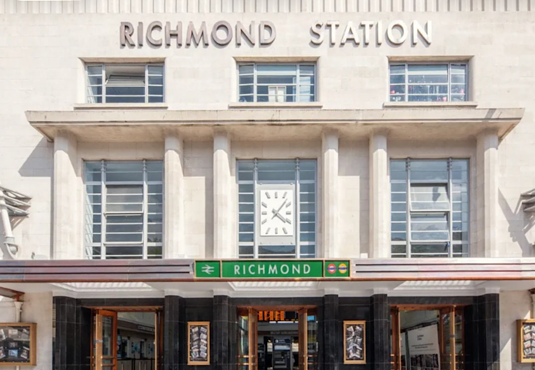
The station was built in 1937 in an Art Deco style with pillars and mouldings of Portland stone incorporating at the centre of its façade a most elegant, even engaging square clock. Over the years, however, the building became grubby, with bits badly repaired, the signage corrupted or lost and the brass awning ‘disappeared’. Importantly, for me, even in its most dilapidated state it’s overall dimensions and its unique clock were enough to make it special.
Then, from 2023 – 2025, behind scaffolding and plastic sheeting, the front of the building together with the foyer inside, were refurbished. And what a wonderful job was done (see first illustration). With its cleaned, almost ‘luminescent’ Portland stone, its restored wooden doors with their protective bronze sheeting, its bronze-finished canopy over the entrance and its reinstalled high-level “Richmond” lettering on the facade, the building now looks magnificent.
And in its renovation, seeing in the atrium the newly revealed features is a real treat. Tatty cladding has been removed to reveal an original timber frieze and green glass, new Art-Deco inspired lighting has been installed, and the original shopfronts and signage, together with their oak fittings, are once again in place; just feeling the beautifully crafted oak is a pleasure.
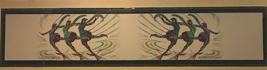
All these ‘building’ improvements have been a delight, but more was to come. Three weeks ago a series of nine paintings were revealed having been mounted in the black and green original tiled surrounds on the walls of the staircase that leads down to the platforms. All the poster-sized paintings were done by Cyril Power, an artist who worked with and was inspired by the rhythmic lines of the underground, and who I first discovered when visiting the exhibition ‘Rhythms of Modern Life: British Prints, 1914 -1939’ at Boston’s Museum of Fine Arts in 2007. Indeed, it was at that exhibition that I learned about, and was enthralled by, the UK’s Vorticist movement. Power’s dynamic illustration of ‘Skaters’ – is mounted across the arch above the well of the station staircase (see second illustration).
These nine paintings top off the most wonderful renovations to the station, and together with all the Underground designs and the magnificent station itself make the London Underground feel like an organisation that offers what Pick wanted to convey – a service that is safe, accessible, welcoming and trustworthy. Moreover it reminds one of his enduring influence. How very rare it is to have created a tradition that lasts a century – we have been very lucky!
The first illustration shows a photo of the front of the recently renovated Richmond Station.The second illustration is a photo of the newly installed ‘Skaters’ poster on the arch spanning the staircase that leads to the platforms beneath the atrium of the station.
For helping me write this blog, I would like to thank Lynne, Sarah, Rohan and Vivien.

