I may be imagining things but colours mean more to me now than I can ever remember. I have always been aware of colours, and of patterns in particular, but now they feel vibrant, defined and captivating. In addition, over the summer they have started to demand my attention. From the simplest to the most elaborate, all have become important, although with those that are particularly subtle the pleasure is that much greater.
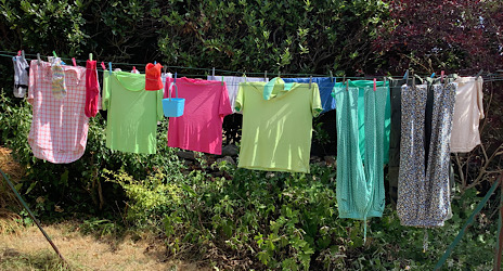
Oddly, my new awareness started on Saturday mornings. These are wash days in Tréguennec and I would find myself mesmerised by the fluttering colours on the line (see first illustration). These colours are in no way special but nevertheless, when I went past, I would often stop to stare, puzzle and enjoy. As silly as it may sound, seeing these blocks of bright colours in no particular order was a new treat.
More lasting, and to an extent even thrilling, have been colours that need discerning, that interact both with one another and with their surrounds. It was just such an arrangement that I found myself staring at when visiting an exhibition of traditional costumes of our area – le pays Bigouden.
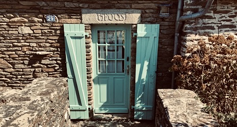
There must have been some fifty or so exhibits – dresses, skirts, coats, blouses – all of which would have been worn on special occasions such as weddings and birthdays. However, as I walked round it was a man’s hat that caught my eye. It was a beautifully crafted replica of a hat worn in the early 1800s and its attraction for me came from a set of three fine gold, red and blue chenille silk threads looped around its black crown (see second illustration).

Although I looked at all of the exhibits, none had the same appeal. Indeed I went back several times for a close inspection – I did not want to miss any details – and memories of its colouring still linger. Interestingly, in the past I would probably have missed the hat altogether, and had I seen it, I doubt if I would have registered its colouring. All this is new to me.
Unexpectedly, my new awareness of colour, and with it a feeling of confidence has introduced a conflict. A few weeks ago Rohan repainted our front door and its shutters (see third illustration). Together we had chosen the colour and when the paint had dried I commented how much I liked the ‘blue’ we had bought. In response, Rohan said how much she liked the new ‘green’. Neither of us is colour blind but it was clear that we saw the colour differently – a difference that remains unresolved. In keeping with the demands of the digital world, the label on the paint pot didn’t help – it just gave the paint’s name as ‘178C’.
While our views on the colour have not changed, it is worth noting that such a disagreement could never have happened if Rohan and I spoke only Breton. In this language, there is no distinction between blue and green with just the one word used for describing them both – ‘glas’.
While some readers may see my improved ability to see and enjoy colours as the product of wishful thinking, I believe it to be a real change. Nine months ago I had my cataracts removed. Cataracts are well known to impair vision, not only is focussing difficult, colours often become faded. Prior to the operation I had not realised how much fading had occurred and immediately afterwards, seeing the shimmering greens of the leaves was a wonderful surprise. It is likely that other colours will also have faded and it has taken months for my brain to register and adjust to the new clarity. Only now are the colours seen in their fullness.
While to some the changes in my vision may seem fanciful, to me they are very real and the vibrant images I now see are a delight. I just hope my colourful viewing will last.
The first illustration is a photo of clothes drying on our washing line in Tréguennec earlier this summer.
The second illustration is a photo of the decorated black hat mounted above the top of its matching coat; both were displayed on a mannequin at a recent exhibition of traditional Breton clothing. It was the colours of the three bands around the crown that I found mesmerising.
The third illustration is a photo of the recently painted front door of Ty Poas, our home in Brittany. Is the colour blue or green? For years the house had neither name nor number and to help direct deliveries and visitors we had the name ‘Ty Poas’ engraved on the lintel above the door on the advice of the mayor. Ty Poas actually means ‘Burned House’, so we assume that our house, which is probably over 200 years old, was built on the site of a house that had burned down.
For helping me write this blog I would like to thank Sarah, Armelle, Rohan and Vivien.

Dear Joe,
Definitely blue to me, but when I looked more closely I realized it was very similar to the color “teal” that was adopted by many of our independent candidates in our recent election!
Love
Robin
LikeLike
Dear Robin, Thank you for your comments. I think we are in the minority – most people seem to think it is green. Love, Joe
LikeLike
Welcome!
LikeLike
Dear Merrily. Touché. But don’t take things for granted – colour vision can change quite quickly. Love, Joe
LikeLike
I would call it turquoise. Love the colour. Look forward to seeing you beg October. You are both very missed. It seems so quiet without you. K xx
LikeLike
Dear Kaye, Thanks for your comments. Turquoise is a good compromise. We will be back for the first Sunday in the month tea in October. Love, Joe Clever answer
LikeLike
Dear Joe
I enjoyed this. From the start cataracts came to mind, so I was satisfied when you revealed that you have new lenses. The door and shutters look very handsome. I would say green. Glas is the word for blue in Welsh, but we have a different word for green – gwyrdd. I hope your heightened awareness and enjoyment of colour remains, but I guess it might fade as you get used to it. We don’t have a recollection of how we perceived colours when we all had fresh clear lenses and we don’t notice the fading. It almost makes having to have cataracts fixed something to look forward to (as well as having short-sight corrected in my case).
LikeLike
I’ve just remember that in Welsh we say glaswellt for green grass!
LikeLike
Dear Andrea, Thank you for your comments. You say that in Welsh there are words for green and blue. I wonder what the position is for Cornish. Generally Breton and Cornish are particularly close. Love, Joe
LikeLike
Joe,
Another most engaging piece. My view of the door is green. Extremely interesting that with cataracts for some time, your brain’s idea of colours dimmed.
Are you familiar with the work of the Turkish artist Esref Armagan? He has never been able to see, but paints pictures of things/people/ landscapes from touch. If not, it’s worth a Google; his work is amazing, and most importantly, it’s remarkably vibrant, and yet he’s never ‘seen’ a colour.
LikeLike
Dear Rissoles, Thank you very much for your comments and particularly for introducing me to Esref Armagan and his paintings. His work introduces a whole new world. Yours, Joe
LikeLike
I enjoyed reading your blog Joe; I always associate the Colliers with vibrant happy colours… your pink shorts being the brightest!
The colours around the hat are lovely, do they have any significance?
The door looks green to me (beautifully painted by Rohan), and it was definitely blue before the makeover.
LikeLike
Dear Carolyn, Thank you for your comments. I don’t know if the colours have any particular significance. However, I have been told that this hat is unusual as on later hats such colouring is rare. Love, Joe
LikeLike
Loved your colourful blog Joe. What a joy to be able to see and enjoy colours like that. Many of us pre-cataract operation older citizens don’t realise that colours are fading. After reading your blog, I will look forward to having mine ‘done’ one day! In the meantime, I will just keep cleaning my glasses! I love the hat, It does have some kind of attraction, Is it the effect of parallel lines? Mondrian and other artists found them mesmerising. My first reaction to the front door was green but then I questioned that! . I love that the old Breton language doesn’t distinguish.
LikeLike
Dear Mareeg, Thank you for comments. There is, I am sure, something particularly enticing about the three bands. One band, even broad, would not have had the same effect. Love, Joe
LikeLike
Dear Joe,
Another kaleidoscope of colourful thoughts prompted by your blog. I’m siding with Kaye on turquoise although this can conveniently describe green or blue.
The language dimension also reminded me of visits to HMRC at Ty Glas in Cardiff – business trips rather than being summoned by the Inland Revenue – which I now learn means ‘Blue House’ in Welsh (or ‘Green House’ to continue the gentle confusion).
And finally, the Breton hat looked to me to be similar to the James Webb telescope pictures of the rings of Saturn.
LikeLike
Dear Alan, Thank you for your many comments. Colour-wise, you and Kaye are hedging your bets. The exam question was what colour – green or blue? Answer please. Yours, Joe
LikeLike
Green is the colour!
LikeLike
Dear Alan, Thank you for the critical decision. Yours, Joe
LikeLike
Movana and I often argue over green or blue – in my humble opinion, your door is a delightful hue of green!
Interestingly the word for green in Irish Gaelic is also ‘Glas’ but apparently this can also mean blue or grey – its original association is with natural colours, which, of course, in the ‘Emerald Isle’ are mostly green.
LikeLike