Just over seventy years ago, on May 4th 1951 to be precise, the Festival of Britain opened to the public. Within a week, my parents, my five year-old sister, Sarah, and I had visited the exhibition and I have never forgotten the aura of the occasion and the excitement it engendered. I don’t understand why I was so moved but feelings of warmth and elation still occur when I see the Festival’s iconic emblem. At the time, the red, white and blue image with its helmeted Britannia atop a compass (see illustration) was everywhere. Apart from being in magazines and newspapers, it was on teapots, key rings, clock faces, biscuits tins, underwear – even rat traps, and the list goes on.
My own memento of the exhibition is a much-treasured postcard of the Britannia emblem. I bought the card years ago and just looking at it gives me a tingle. Despite its importance, I never bothered to discover its origins nor by whom it was designed. However, those close knew that it was something I valued.
Earlier this month, Sarah told me that the emblem was created by Abram Games and that, as part of the Festival’s 70th anniversary celebrations, there was to be a series of lectures on the web about Games and his work. Moreover, were I interested, I could visit his archives and perhaps talk with his daughter Naomi.
The search was now on and my first target was the postcard. Originally I had seen Britannia’s face simply as pretty; now, with my new insights, her face was of a woman proud and unbowed. Next I learned that Britannia faced left for good reason – Games, as was his wont, was endorsing the politics of the then Labour Government. The style of the typeface was also significant; Games chose a font for the numbers in the ‘1951’ that had a carnival feel. It was certainly fun that the nation needed after years of austerity! Finally, and by the subtlest of devices, Games gave the emblem a homely touch. The flags fluttering at the base, which were inspired by clothes on the family washing line, were there to offset any military look.
In my exploration I also learned of the origins of the design. Proposals for an emblem were invited from twelve artists and those the Festivals organisers received were complicated, cluttered and pompous. Hardly a message for the public at large. There was, however an exception, and with its unfussy design, its common touch, its immediate appeal and its layered messages, Games emblem was an obvious winner. Interestingly, as well as showing his originality and trademark precision with colours and shapes, the emblem also showed how Games could communicate his message with few if any words.
As well as Abram Games-the-graphic-designer, I also discovered Games-the-man, and the stories I learned about his life make a picture too. Yes, he was original and inventive but clearly he was also headstrong and difficult – there was much about him that I admired and with which I could identify. Indeed, with every revelation I liked him more.
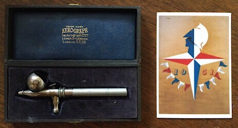
While still at school Games helped out in his father’s photographic studio where he learned how to use the airbrush, a tool he valued throughout his career. In 1941, while a serving soldier, the Public Relations Department of the War Office asked him if he would produce recruiting posters. He declined as he no longer had any brushes, his had been lost when his home was bombed. The Department arranged for Games, accompanied by soldiers, to search through the rubble and there they were in the basement in their original boxes. In no time he began work. In the postcard the shadow thrown by Britannia’s helmet would have been produced by his airbrush.
The airbrush in the illustration is one of those found in the rubble. Importantly, arranging the photo meant that I touched the brush that Games had once used. While I don’t understand the mechanism, not for the first time I find communication through touch – haptic communication – empowering.
Games left school at 15 and went immediately to study at Saint Martin’s School of Art. His studies lasted just two terms and what we now see of Games is the result of his self-taught struggle and that struggle sometimes showed. He was often accused of being arrogant and on one occasion he retorted – When you see my work, surely you will agree that I am actually modest. And he took great delight in including his name on the postage stamp he designed in 1948 – it read ‘Olympic Games’.
Games welcomed criticism but hated censorship. He once saw a soldier tear down a poster of his that showed a dead child. Games was pleased in as much as the poster had done what posters should – it was read and had influence. However, when Winston Churchill banned a poster by Games that showed Britain in an unfavourable light, Games was furious and, according to his daughter, Churchill and an unflinching Games had a real ‘run in’.
Characteristically Games was sacked for jumping. One day, noises of laughter and loud banging came from his studio and his employer opened the door to discover Games leaping over four chairs to a cheering office. He was immediately dismissed. Despite his mother’s pleading he wouldn’t apologise and from then on he remained self employed.
His love of precision followed him to his grave. He insisted that on his tombstone his name would be followed by a full stop. Nothing written, everything said – pure genius.
Games published at least four hundred designs during a career that lasted over sixty years. Through his ingenious techniques he captured audiences and instantly conveyed his powerful messages. He is now rightly seen as one of the top graphic artists and designers of his generation. And, at a personal level, thanks to my new insight, his place as one of my heroes is assured.
The illustration shows on the right my Britannia Card. On the left is an airbrush in its original presentation box once used by Games.
For help with writing this blog I would like to thank Sarah, Jeni, Merrily, Alastair, Naomi, Rohan and Vivien.

Dear Joe
Thanks for this – very interesting. I’d never seen the Festival logo before. The blue part of Brittania has an art deco look I think. Is an airbrush something that you blow through to apply ink or paint? I wonder if the current government is thinking about producing a logo to promote the Union? I expect there might be one for the trains?
LikeLike
Dear Andrea, Thank you for your comment. The little pipe under the handle is attached to an air compressor which blows a very fine spray of the paint through the brush nozzle. The paint sits in the little cup above the handle. I very much hope that the UK Government spares us the use of Games’ icon. Love, Joe
LikeLike
I’m glad I now know something about Mr Games – keep digging for heroes we could enjoy, Joe!
LikeLike
Dear Merrily, I am glad you also like my heroes. I have no further heroes planned for the time being, but one never knows. Love, Joe
LikeLike
Dear Joe,
Sometime not so long ago I signed up for your blogs which I delight in reading. And to hear about you and Rohan, especially during these months of lockdown.
I chanced upon this programme on the BBC iplayer, which I found fascinating especially as it interviews various designers (all very young and just starting out in their careers in the early 1950s) … you may already know of it but if not it has only 12 mire days left to be accessed.
https://www.bbc.co.uk/iplayer/episode/b015d486/the-1951-festival-of-britain-a-brave-new-world
My very best wishes to you all,
Peter
Your once – upon – a – time hairdresser
LikeLike
Dear Peter, Thank you for commenting. It was good to hear from you. I very much enjoyed seeing the 60 year anniversary film. Thanks for that too. You will be pleased to hear that I still have enough hair to make visits to the barber necessary. Yours
Joe
LikeLike